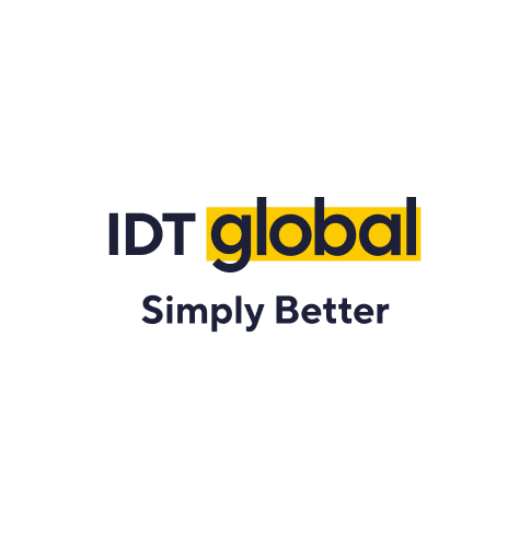
Logo
Our logo is characterised by simplicity and conciseness, representing our brand in general. The logo is a combination of the wordmark and a stripe in corporate colors. The nice thing about our logo is that it’s easy to apply across mediums, and it boosts brand recognition by being clean and uncomplicated.
Visit our media kit page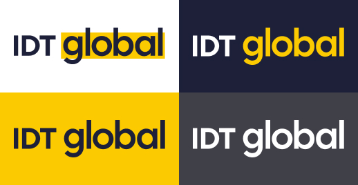

The standard logo size for a website layout typically ranges from 100 to 600 px wide. Do not use our logo in a size smaller than 100×24 px in the digital version, so that our logo does not lose its uniqueness, readability and recognizability.
It’s important to note that social media logos vary in size, ranging from 110px to 600px in width. Therefore, it’s important to check what the best size is for the intended social media platform.
For printing purposes, a vector file is commonly used as it can be enlarged to any size, from small keychains to large billboards.
To ensure proper usage of the logo in a design or alongside other visuals, it’s important to give it enough space to stand out. This is where clearspace and margins become important.
Clear space refers to the distance between the logo and any other graphic element it’s placed next to. The distance from the logo to other graphic elements should be equal to half the height of the logo.
For example, if the height of the logo is 100px, then the space should be not less than 50px.
Simple logo reflects the idea of our focus on main things with nothing distracting.
Also it sets the basis of overall brand design — minimalistic style, typography and brand color.
A Black & White version of logo is used in some print cases when the usage of colored print is impossible. Also it can be used in case of placing above photos and etc. One should consider, that the most prioritized usage of logo is colored one on white or light-grey surface.
On black and white prints with white background, use our Black & White logo.
Download Logo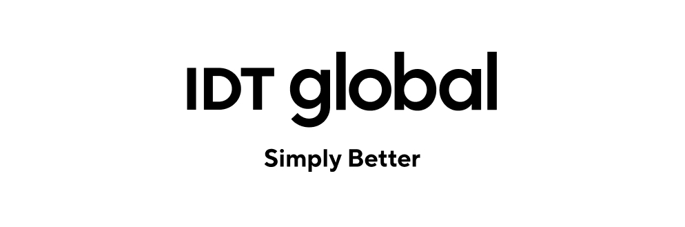
On black and white prints with black background, use our Black & White inverted logo.
Download Logo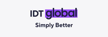

Don’t change logo stripe color

Don’t overuse our yellow stripe

Don’t change logo color in any way

Don’t use rectangle with dark background

Don’t use colored background with our standard logo

Don’t change the logo proportions in any ways

Don’t change the transparency of the logo

Don’t use drop shadows or any other effects

Don’t use strokes or outline logotype
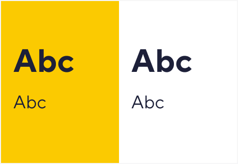
Colors
We have got a truly minimalistic palette, which reflects the uniqueness and recognition of our brand.
IDT global Yellow is a primary color that should be applied across all communication to uphold brand consistency or be used as an accent color. For digital platforms, use Dark Blue to accommodate readability and legibility needs. Also on some design pieces it is appropriate to combine our colors with partner brands pallets.

HEX FCCA00
RGB 252, 202, 0
CMYK 1, 13, 87, 0

HEX 1D2039
RGB 29, 32, 57
CMYK 90, 86, 47, 58
Our secondary color palette is an extension of our primary colors and is used as backgrounds and texture for silhouetted product photography. Where primary colors applied to type fail in legibility and compliance, use Black.
Do not use secondary colors for text. Use only Dark Blue or Black text. Secondary colors can be used with our core colors, but this should be limited.

HEX F6F6F7
RGB 246, 246, 247
CMYK 0, 0, 0, 3

HEX 2E39D3
RGB 46, 57, 211
CMYK 78, 73, 0, 17

HEX 000000
RGB 0,0,0
CMYK 0,0,0, 100
In addition to the main and secondary colors, system colors are used in the digital version.

HEX FF8F3E
RGB 255, 143, 62
CMYK 0, 44, 76, 1

HEX F04545
RGB 240, 69, 69
CMYK 0, 71, 71, 6

HEX 33D37D
RGB 51, 211, 125
CMYK 76, 0, 41, 17

HEX 00ADE6
RGB 0, 173, 230
CMYK 100, 25, 0, 10
If you want to use IDT Sans in your integration please seek approval via alexander.lopatyuk@idt.net
Download Font FamilyIn cases when you can’t use IDT Sans (or it doesn’t contain the characters needed), you have to choose one of our fallback fonts. If you can’t use any custom fonts in your work, try commonly available defaults in this order:
Additional Elements
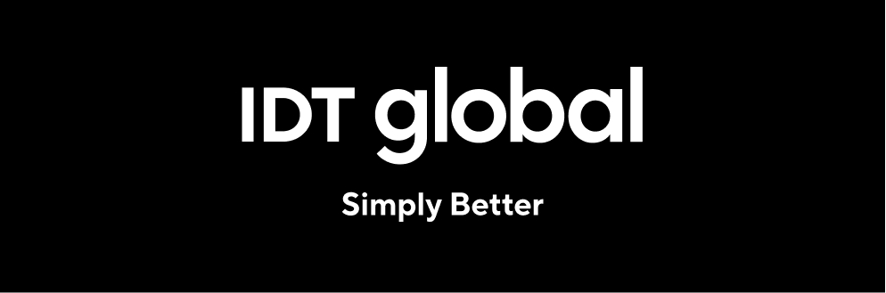
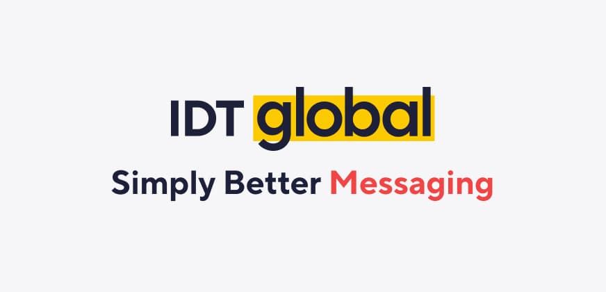
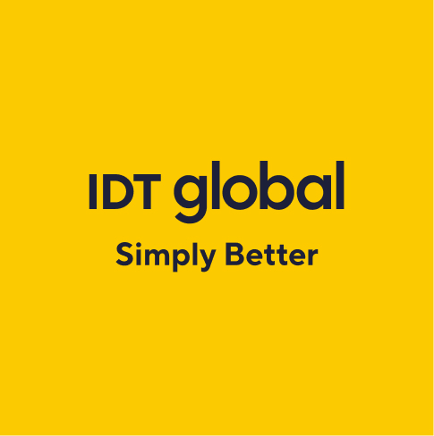
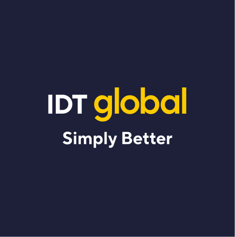
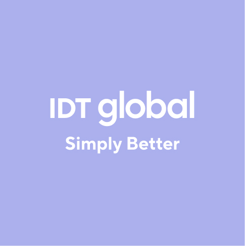
Simply Better is our brand’s main motto, mostly used with putting one of the main services provided by IDT global next. Also can be used in other cases like corporate ones (Simply Better Employees e.g.)
IDT global icons are simple, outline and bold and are used across different brand touch-points from marketing to environment to product. It is both appropriate to use only Dark Blue color or a pair of colors (Dark Blue + Secondary Blue). Also we can use only one auxiliary color for icons that are interactive (part of CTA on website etc.)


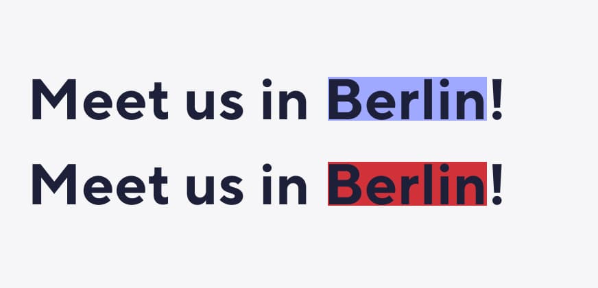
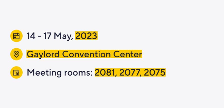
IDT global stripe is a part of our brand awareness, so we often use it in web and marketing design to emphasise the correlation with IDT global, as well as minimalism and simplicity.
It should be not overused on design (screen, leaflet, page), creating a single rhythm with our logo, but should be a little distant from it, to not argue with each other.
Don’t change our rectangle color
Don’t overuse our yellow rectangle
Don’t change the motto colors in any way
Don’t use colored fonts except for special moto part
Don’t use regular fonts for headings
Don’t lose contrast between headings and paragraph
Proprietary Rights: The IDT global name, logo, and all related product, service names, fonts design marks, and slogans are trademarks, service marks, or registered trademarks of IDT global and may not be used in any manner without the prior written consent of IDT global.
You can find and download all our brand assets for partner material usage on the Media Kit page.
It should be not overused on design (screen, leaflet, page), creating a single rhythm with our logo, but should be a little distant from it, to not argue with each other.